As you all know, Warrior has just launched the 3rd kit for next season causing the social media (and traditional media) to explode with jokes, comments and in some cases outrage. What were Warrior thinking? Mismatching socks!! Made you dizzy if you stared at it for too long and it looks more like a jester outfit than a football kit.
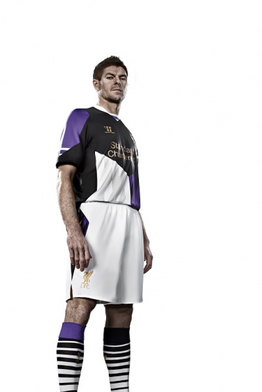
In the past it didn’t bother me much when we got a weird or ugly design for our away kits, if I didn’t like it I simply didn’t buy it. However this follows the release of the away kit a few weeks ago, this kit reminded me of the game “Manic Miner” I used to play on my ZX Spectrum 30 years ago. The only people I can see being happy with our away kits this season are the BPL.. Believe me, it is going to be difficult to watch a game on pirated web stream when all these colours keep smudging all over your desktop.
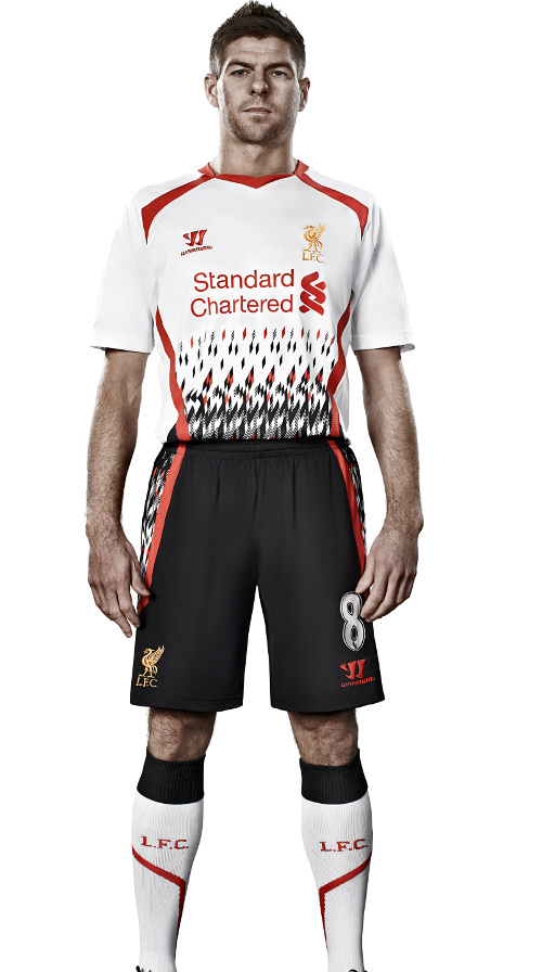
Are we seeing a trend here?
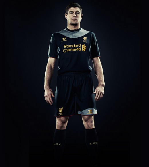
Last season was Warrior’s first year making football kits for a professional football club so many of us gave them a pass. Of course we remember what they came up with. There was the famous “wet suit” looking away shirt which made our rival fan exploit it on Photoshop, especially when there were allegations of Luis Suarez diving.
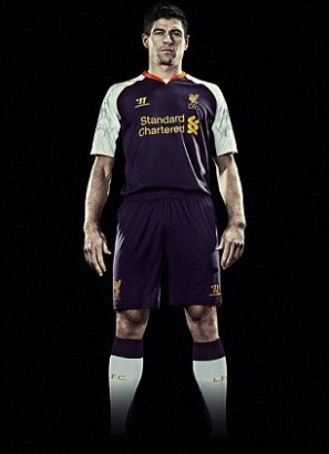
And there was the famous “Lampshade” looking one, last season’s 3rd kit.
So what is going on here? One would think that Warrior would have been more careful this season and do better due diligence before releasing such kits, or this part of their overall strategy? If you look at the media coverage they got with these kits. Would they have gotten more if the kits were simple, elegant and everyone loved them?
This seems to be a corporate trend at Warrior, are they using ‘Shock Value’ to get people to pay attention. Again last month they released a pair of shoes with a special feature named after popular sexual activity found in porno movies. And again the news media noticed, giving Warrior free press.
Warrior are trying to get their name out there and as far as that is concerned they are doing a great job. Going up against the giants of Nike and Adidas is no easy task, so is this part of their strategy on how they build their brand?
If this is the case then I don’t like it, after all it is our players who have to wear these kits. It is our club’s crest and the Hillsborough flames that are embroidered on them.
Dear Warrior, is it too much to ask for a nice simple classy away kit like the ones below?
Yes, I would buy both.
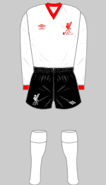
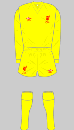
More images of Liverpool’s historic kits can be found at the excellent site Historic Kits
http://www.historicalkits.co.uk/Liverpool/Liverpool-change-kits.html
